
Designing accessible and independent living spaces for visually impaired individuals: a barrier-free approach to interior design | International Journal for Equity in Health

Circulation and arrangement
The spatial organization of the house follows a linear arrangement, with rooms positioned at a 90-degree angle to a 1.5-m-wide corridor, ensuring efficient circulation and accessibility throughout the space (Fig. 8). This corridor acts as the primary circulation axis, connecting different functional areas while maintaining a sense of openness. Intermediate concrete walls serve a dual purpose: they provide structural stability while also defining the spatial layout by integrating seamlessly into the architectural composition. Their strategic positioning eliminates unnecessary physical obstructions, promoting smooth movement and an uninterrupted flow of space.

Circulation layout. (Source: Author)
Lighting and privacy
A critical challenge in the design is balancing adequate natural illumination with the privacy needs of blind occupants. To address this, all windows are placed at the upper sections of the walls, ensuring that while ample daylight enters, external visibility into the interior is restricted. This configuration results in a continuous glazed façade along the length of the corridor, optimizing natural light penetration without compromising security. Furthermore, the courtyard plays a significant role in both lighting and privacy management. Functioning as a secluded outdoor space, it remains shielded from public view while allowing multiple rooms to benefit from diffused daylight. The interplay of spatial arrangement and lighting strategies enhances both usability and comfort (Fig. 9).

Light source. (Source: Author)
Material properties
The house is designed with a clear distinction between its lower and upper sections, both in terms of materiality and structural function. The lower section consists of heavy materials such as stone and reinforced concrete, while the upper section incorporates lightweight materials, primarily wood and glass. This duality in construction materials is deeply rooted in the experience of blind individuals, who rely on tactile perception to understand and navigate their surroundings. The use of dense, solid materials in the lower section ensures that occupants feel a sense of stability and security when touching the surfaces, reinforcing their confidence in the structural integrity of the space. The psychological impact of material weight is crucial—stone and concrete convey a feeling of permanence and immovability, which is essential for individuals who lack visual confirmation of their environment. In contrast, the upper section, which features lightweight structural elements, introduces openness and illumination without diminishing the groundedness provided by the base. Concrete and stone retain heat during the day and release it at night, maintaining a stable and comfortable indoor environment. These materials also serve as acoustic buffers, reducing external noise and creating a calm, enclosed space that enhances the sensory perception of touch and sound. The tactile feedback from rough stone surfaces and smooth concrete walls offers additional spatial cues for navigation, assisting blind occupants in orienting themselves without reliance on visual input. This careful attention to material selection transforms the house into a space that not only accommodates but actively enhances the experience of its users.
Curtain windows form a significant part of the upper structure, allowing diffused natural light to permeate the interior. This is particularly important for individuals with partial vision or sensitivity to brightness variations, as it ensures a well-lit environment without causing glare.
A defining feature of the house is its central courtyard, which is enclosed by surrounding walls. This architectural decision ensures a high level of privacy while also facilitating easy access to all rooms. The courtyard functions as a transitional space that provides controlled outdoor exposure without compromising security. Because it is entirely surrounded, occupants can experience fresh air, natural sounds, and changing weather conditions in a protected environment. This is especially beneficial for blind individuals, as sensory engagement with external elements—such as the sound of rustling leaves, the temperature of the air, and the scent of vegetation—contributes to their spatial awareness and orientation. Unlike open gardens that might present risks of exposure or navigation difficulties, this enclosed courtyard offers a safe and predictable outdoor experience.
The arrangement of rooms follows a logical sequence that prioritizes ease of movement and intuitive navigation. The circulation paths are defined by the transition between the heavy lower section and the lighter upper section, providing both physical and perceptual cues that guide movement. This thoughtful planning minimizes the need for visual orientation by incorporating haptic and auditory references. For instance, textured flooring materials indicate different functional zones, while the acoustics of each space are subtly modulated by the choice of materials to enhance spatial differentiation.
Lighting within the house is meticulously planned to balance privacy and illumination. The upper section’s curtain windows are designed to allow natural light to filter through without creating harsh contrasts that might disorient visually impaired occupants. The placement of windows at higher levels ensures that light is evenly distributed while preventing direct views from outside, maintaining privacy. The combination of indirect daylight and strategically placed artificial lighting ensures that each space is comfortably illuminated without excessive brightness or dark shadows. In the courtyard, light reflections off the surrounding walls create a soft, ambient glow that further enhances visibility without causing glare.
The house embodies a synthesis of sensory-conscious design and technical precision, creating an environment that is both functional and emotionally resonant. By leveraging material properties to enhance tactile perception, thermal comfort, acoustic quality, and structural stability, the architecture establishes a deeply intuitive and inclusive living space. The enclosed courtyard, acting as both a spatial and environmental regulator, further reinforces the balance between security and openness, privacy and connectivity. Through these deliberate design choices, the house transcends conventional architectural norms to create a space that responds intelligently to the needs of its users.
In-habit
In-Habit is an advanced accessible housing system designed to enhance spatial perception and navigation for visually impaired individuals. Drawing inspiration from the Braille system, it employs a rectangular grid that allows users to place tactile tiles representing architectural elements, thereby creating a personalized and readable floor plan. This user-centric approach ensures that the living environment aligns with an individual’s daily habits, facilitating efficient circulation and intuitive wayfinding. By integrating sensory-driven design principles, In-Habit represents a significant step forward in the field of interior design for visually impaired users.
Tactile navigation and wayfinding
In-Habit prioritizes tactile-based navigation by incorporating raised patterns and textures that serve as spatial indicators. This concept aligns with the fundamental principle that visually impaired individuals depend on touch and proprioception to interpret their surroundings. The system’s flexibility allows users to configure the layout to their specific needs, ensuring intuitive movement within a consistent and predictable environment. Textured floor surfaces, such as ridged pathways leading to key areas like the kitchen, bedroom, or bathroom, further enhance wayfinding while reducing disorientation.
Tactile indicators are strategically placed to provide feedback regarding spatial transitions, such as changes in room function or proximity to doorways. Different materials and surface finishes—such as rubberized grips for safe stepping zones and contrasting textures for different pathways—help users navigate safely without reliance on visual input. By reinforcing spatial orientation through haptic feedback, In-Habit enhances the overall accessibility of residential spaces.
Adaptive spatial configuration
Unlike conventional fixed layouts, In-Habit introduces flexibility in spatial arrangement by allowing users to modify the placement of tactile tiles. This adaptability ensures that the design caters to individual routines and preferences, promoting a sense of autonomy and independence. The ability to adjust the floor plan over time ensures long-term usability, accommodating changes in lifestyle, mobility requirements, and accessibility needs.
Incorporating modular elements, such as movable partitions and adaptable furniture, further enhances spatial customization. For example, foldable walls or sliding partitions enable users to reconfigure rooms based on different activities, whether creating a larger communal space or segmenting smaller, private areas. The integration of height-adjustable counters, shelves, and workspaces ensures that accessibility remains paramount, allowing individuals to interact with their environment comfortably and efficiently.
Multi-sensory design integration
In-Habit employs a multi-sensory design approach by integrating auditory and olfactory cues alongside tactile elements. Flooring materials vary to provide additional sensory feedback: wood flooring is used in living areas for warmth and comfort, while stone or textured ceramic tiles indicate transition zones such as bathrooms and kitchens.
Subtle sound cues are incorporated through acoustic zoning, allowing users to differentiate spaces based on reverberation and echo characteristics. For instance, softer furnishings and sound-absorbing materials are used in relaxation areas, while high-frequency sound reflection is utilized near entryways and functional spaces to enhance spatial perception. Furthermore, strategically placed diffusers with essential oils or natural fragrances differentiate rooms, adding another layer of navigational assistance by associating specific scents with particular areas of the house.
Accessibility and safety enhancements
In-Habit prioritizes safety by minimizing obstacles and ensuring seamless transitions between spaces. Rounded furniture edges, strategically placed handrails, and non-slip surfaces mitigate the risk of falls or injuries. The grid-based tactile tile system serves as both a wayfinding tool and a hazard marker, alerting users to floor-level changes or functional zones such as staircases and doorways.
Additionally, smart home technologies, such as voice-activated controls, motion-sensor lighting, and haptic feedback systems, provide real-time assistance. Automated lighting systems adjust brightness based on occupancy and time of day, preventing abrupt lighting changes that could be disorienting. Temperature and humidity sensors ensure environmental comfort, alerting users to changes that may require attention.
Ergonomic considerations and universal design principles
Ergonomic design plays a critical role in making interior spaces both functional and comfortable for visually impaired users. In-Habit incorporates adjustable-height furniture, user-friendly storage solutions, and intuitive appliance placement to maximize accessibility. Elements such as pull-down shelving, voice-guided smart kitchen appliances, and touch-sensitive controls provide convenience and ease of use.
The modular design supports universal design principles, making spaces inclusive for a diverse range of users, including elderly residents and individuals with mobility impairments. Furniture layouts are planned with ample clearance to accommodate assistive devices such as canes, wheelchairs, or guide dogs, ensuring unhindered mobility within the home.
Cognitive mapping and memory retention
The Braille-inspired design of In-Habit aids cognitive mapping by creating a spatial language that visually impaired users can easily interpret (Fig. 10). The strategic repetition of tactile markers strengthens memory retention, allowing users to develop an internalized mental map of their surroundings.
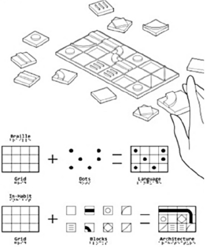
Grid map made to memorize the plan of the house. (Source: Author)
This aspect of design reduces cognitive overload and fosters confidence in independent navigation. The presence of consistent spatial cues—such as distinct wall textures, recessed floor pathways, and embedded auditory indicators—reinforces orientation, making navigation instinctive over time. Additionally, labelled touch-responsive surfaces, which provide auditory descriptions when activated, further enhance cognitive engagement within the built environment.
In-Habit exemplifies the integration of accessible and inclusive interior design principles, offering visually impaired individuals greater autonomy, comfort, and safety within their living spaces. Its emphasis on tactile navigation, adaptive spatial configurations, multi-sensory design elements, and enhanced safety measures demonstrates a holistic approach to accessibility. By bridging the gap between sensory experience and architectural functionality, In-Habit serves as an exemplary model for future developments in adaptive and inclusive interior design, setting a new benchmark in designing for accessibility.
Prototype
A prototype has been provided, though this system is flexible and can be adapted for any site using the modular system. It consists of a gridded structure, hinged louvre panels, and a rainwater drainage system. These elements can be modified to best harness the natural sunlight, ventilation, and rain to maintain the internal environment (Table 7).
Each arrangement creates a unique internal environment, which is identifiable by temperature, ventilation, and air pressure (Fig. 11). The microcosms nurture the growth of different plant species, offering an array of scents that can be used for wayfinding by the occupant (Table 8).

The plan for temperature, ventilation, airflow, and scent. This system helps the client in finding their way through the house. (Source: Author)
Spatial requirements
The spatial arrangement in accessible environments for visually impaired individuals is informed by empirical findings and established research on wayfinding, tactile navigation, and sensory integration. Studies have shown that wide pathways and minimal barriers enhance independent mobility by reducing the risk of collisions and facilitating intuitive navigation [23]. The strategic placement of furniture along the periphery aligns with universal design principles, ensuring that movement is unobstructed while maintaining functional efficiency [24]. The use of tactile materials and contrasting flooring to demarcate spaces builds upon research indicating that sensory cues significantly aid spatial orientation [25]. Empirical studies have demonstrated that continuous flooring with level transitions mitigates fall risks and enhances proprioceptive feedback, reinforcing its application in accessible design [26]. Artificial lighting strategies in visually impaired-friendly environments are guided by research on contrast sensitivity and glare reduction. High-intensity LED lights installed in layered configurations address findings that layered lighting improves visibility and depth perception for individuals with low vision [27]. Task lighting focused on countertops aligns with recommendations from the Lighting Research Center (LRC), which advocates targeted illumination for enhanced functional use [28]. The integration of tinted glass and translucent wall panels is supported by studies indicating that diffused light reduces harsh reflections and glare, which can be disorienting [29]. Empirical data further emphasize the importance of backup lighting solutions, such as rechargeable flashlights positioned at key locations, to ensure uninterrupted navigation in low-light conditions [30]. Tactile wayfinding strategies, such as grooved tiles and raised patterns, draw from research highlighting their effectiveness in guiding individuals with visual impairments [31]. Contrasting textures for transitions between spaces, such as smooth wood for living rooms and textured stone for hallways, build on findings that textural differentiation reinforces spatial cognition and room identification [32]. The incorporation of olfactory cues, including aromatic plants like lavender in entryways and jasmine in courtyards, aligns with evidence suggesting that distinct scents serve as spatial markers and contribute to environmental familiarity [33]. The placement of Braille-embedded signs near switches, doorways, and cabinets follows best practices outlined in ADA guidelines, which advocate for multi-sensory signage to facilitate independent navigation [34]. Auditory cues, such as soft chimes and distinct floor creaks, are informed by research indicating that sound differentiation assists with spatial awareness and movement coordination [35]. The application of textured concrete near doorways and staircases aligns with empirical evidence demonstrating that haptic feedback improves hazard detection and spatial recognition [36]. Similarly, rubber tiles with raised patterns in wet zones such as bathrooms are based on studies that highlight their slip-resistant properties and tactile clarity [37]. The inclusion of tactile buttons on appliances is consistent with universal design research, which advocates for haptic interaction to enhance usability for individuals with vision impairments [38]. Acoustic considerations are rooted in studies on spatial hearing and noise control. The use of fabric-wrapped panels to absorb echoes and minimize auditory interference aligns with research demonstrating that controlled acoustics improve speech intelligibility and environmental perception [39]. Rugs and carpets are strategically placed to reduce impact sounds while allowing sufficient auditory feedback from footsteps, reinforcing findings that controlled auditory stimuli support spatial orientation [40]. These integrated strategies establish a cohesive, evidence-based approach to designing spaces that enhance accessibility and independence for visually impaired individuals.
Lighting
Boost the amount of artificial and natural light in the space. Install task lighting with the light directed toward the task rather than the user’s eyes in areas where reading and cooking are the most important duties. For light fixtures, go with 60–100 W bulbs [22]. To minimize shadows and dark areas, use homogeneous illumination [41]. Install movable shades to allow natural light to enter the home during the day. Throughout the home, place flashlights in strategic locations for when you need a bit more focused light. Light switches should be painted in a vivid, contrasting hue. Tinted Glass Windows [42]. Translucent Wall Panel Systems. Canopies for controlling glare and shadow. Matte Finished materials to avoid glare [43].
Wayfinding
A visually impaired person needs navigation to help them navigate through space, hence architects are responsible for creating designs that incorporate this function (Fig. 12). It can be accomplished in a few different ways, such as by arranging various materials in a pattern on the ground to direct people, directing them with scent, or constructing a trail with tactile elements [44].

Wayfinding tiles on the roads designed for blind people. (Source: www.tactilesolution.ca)
Tactile material.
In a structure that is accessible to the blind, tactile materials, or materials that stimulate the sense of touch to detect them, are extremely beneficial because a person with limited vision cannot see the materials within a place (Fig. 13). A variation of textures like that of a stone surface vs a textured concrete wall can generate a big impact for a visually impaired individual to experience a room. The way these textures and materials are combined makes it possible to distinguish between the various areas and establishes a navigation system (Fig. 14) [37].

Tactile tiles used for people with blindness. (Source: polycrafts.com.pk)

Directional guide for people with blindness. (Source: www.arch2o.com)
Acoustics
Overindulgence in loud noises might cause discomfort for a visually impaired individual whose primary sense is hearing. A blind person will use sounds in their environment to guide them when moving about, so acoustic treatments for walls and other surfaces are crucial. The room”sounds better”and seems cozier when irritating noises like loud chattering or mechanical vents are muted and more natural sounds like footsteps or water droplets pouring are allowed to come through. Similar to how bats use echolocation [30, 46], blind people can emit clicks, claps, or tapping sounds with a cane and analyze the echoes bouncing back. Understanding the Soundscape, the soundscape refers to the collection of sounds that make up the acoustic environment. Blind people become attuned to the subtle variations in echoes based on the size, shape, and material of surrounding objects. For instance, a hard wall will produce a sharper echo compared to a soft curtain. This allows them to identify doorways, furniture placement, and even the presence of other people in the space [31, 47].
Sense of smell
In addition to using touch to hear and feel items (Fig. 16), one can also improve one’s sense of smell. Another way to help someone navigate a building and tell one area from another is to use aromatic plants or flowers. Fragrant flowers in the grounds at the Center for the Blind and Visually Impaired in Mexico serve as sensory guides that assist people in finding their way around the building [47].
Design solution
The proposed project focuses on crafting a haven for individuals who are visually impaired. The residence prioritizes independence, safety, and comfort, fostering a sense of empowerment and enriching their lives. This design caters to individuals with varying degrees of vision impairment, from complete blindness to low vision. The residence is adaptable for different age groups and mobility. Create a barrier-free environment with clear circulation paths, designated handrails, and minimal trip hazards. Integrate features that minimize potential dangers like strategically placed grab bars, contrasting floor textures to mark transitions, and well-lit pathways. Design a clear and predictable layout for easy spatial awareness and mental mapping. This includes designated zones for specific activities and consistent furniture placement. Utilize contrasting textures, incorporate sound cues orientation, and strategically place ample natural light for a stimulating and informative environment (Fig. 14).
Incorporating the mentioned elements into the design of a residence for a partially blind individual involves a seamless blend of architecture (Fig. 15), interior design, and sensory accommodations (Fig. 16).

Concept board applied in the design. (Source: Author)

Material board applied in the design blindness. (Source: Author)
Spatial requirements
Rooms are arranged with wide pathways and minimal barriers. For instance, furniture is strategically positioned along the edges of the space to create open corridors (Fig. 17). Functional areas like the living room, kitchen, and bedroom are organized logically, with clear demarcation through tactile materials or contrasting flooring. Continuous, unbroken flooring with level transitions ensures safe navigation. Artificial Lighting: High-intensity LED lights are installed in a layered fashion. Task lights in the kitchen are focused on countertops, while reading lamps are angled to avoid glare on reflective surfaces. Large windows with movable shades allow for regulated daylight. Tinted glass prevents harsh glare, and translucent wall panels distribute light evenly throughout the space. Rechargeable flashlights are placed near critical points such as doorways, bedsides, and workspaces for immediate access during low light conditions. Tactile pathways using tiles with grooves or raised patterns guide users toward specific areas (Fig. 17). Contrasting textures indicate transitions between rooms, such as smooth wood for the living room and textured stone for hallways (Fig. 18). Aromatic plants like lavender in the entryway or jasmine in the courtyard provide sensory markers. Distinct smells in bathrooms and kitchens help in identifying these spaces. Braille-embedded signs are placed near switches, doorways, and cabinets for added assistance. Sounds like soft chimes or distinct floor creaks signal location changes. Smooth plaster for neutral zones. Textured concrete or stone near doorways and staircases for tactile differentiation. Carpets with a specific texture in sitting areas. Rubber tiles with a raised pattern for wet zones like bathrooms (Fig. 19). Tactile buttons on appliances. Soft, rounded edges for tables and counters to prevent injuries.

Layout plan showing the wayfinder. (Source: Author)

Sectional elevation showing the tactile walls. (Source: Author)

Interior view showing the tactile walls and Wayfinder. (Source: Author)
Walls are treated with fabric-wrapped panels to absorb echoes and reduce noise from adjacent spaces. Rugs and carpets reduce impact sounds while allowing auditory feedback from footsteps.
Silent vents and low-noise appliances minimize mechanical sounds. Gentle fountains or indoor waterfalls provide auditory orientation. Strategically placed materials like wood and stone enhance echo clarity for echolocation. Plant fragrant herbs like basil and rosemary near the kitchen garden for olfactory guidance. Essential oil diffusers in specific zones with consistent scents to help users differentiate areas.
Accessibility enhancements
Light switches painted in high-contrast colors are placed at accessible heights and complemented with braille labels. Cabinet handles with distinct tactile finishes help in identification. Consistent positioning to establish familiarity and ease of movement. Sofas and chairs with contrasting upholstery make them visually identifiable (Fig. 19). Shadow and Glare Control Installed over windows and patios to diffuse harsh sunlight. Floors, walls, and countertops have non-reflective finishes to minimize glare. By prioritizing functionality and user experience, the design ensures an inclusive, comfortable, and aesthetically pleasing environment for partially blind residents.
link


